


Shakes, Sass & Storytelling
Let’s face it—branding a burger joint is no walk in the park. It’s more like juggling flaming milkshakes while riding a unicycle. But when Hot Heffer came knocking, the challenge wasn’t just to build a logo—it was to create a whole vibe. One that oozes character, confidence, and a hint of cheeky charm. Here’s how the logo, the mascot Queenie, and the whole aesthetic came to life.
⚡Vision Meets Vibe: The Spark Behind the Brand
Every great design starts with a question: “What are we trying to say?”
For Hot Heffer, it was all about bringing sass, flavor, and unforgettable personality to the table. I knew right off the bat this brand needed more than just pretty fonts—it needed attitude. The name “Hot Heffer” itself is playful and edgy, so the visuals had to match that energy. Think 1950s diner meets pop art meets modern street style.
What readers can expect: a peek behind the curtain into logo design, character development, color psychology, and building a brand personality from the ground up.
🎨 “Make It Pop”: Crafting the Color Palette with Purpose
Color isn’t just decoration—it’s emotion in visual form. I wanted the palette to be bold and memorable.
-
Hot pink: the star of the show. Bold, punchy, playful.
-
Rich purple: adds depth and flair.
-
Black: grounds the palette with a bit of edge.
-
Vibrant yellow: adds zing—like mustard on a perfectly grilled burger.
💡 Pro tip: A study by the University of Loyola found that color increases brand recognition by up to 80%. These shades weren’t random—they were handpicked to stick in people’s minds like a catchy jingle.
🔠 Logo Love: Designing a Text Mark That Sings
The Hot Heffer wordmark went through several iterations. The final version combines a retro script for “Heffer” with a glowing, flame-kissed “Hot.” Why? Because it’s all about balance: vintage flair with modern heat.
I pushed for typography that had weight, personality, and flow. Rounded edges softened the sass just enough to keep it friendly, while the yellow glow gave it that “hot off the grill” vibe.
📣 Design legend Paul Rand once said: “Design is the silent ambassador of your brand.” This logo had to speak volumes—and fast.
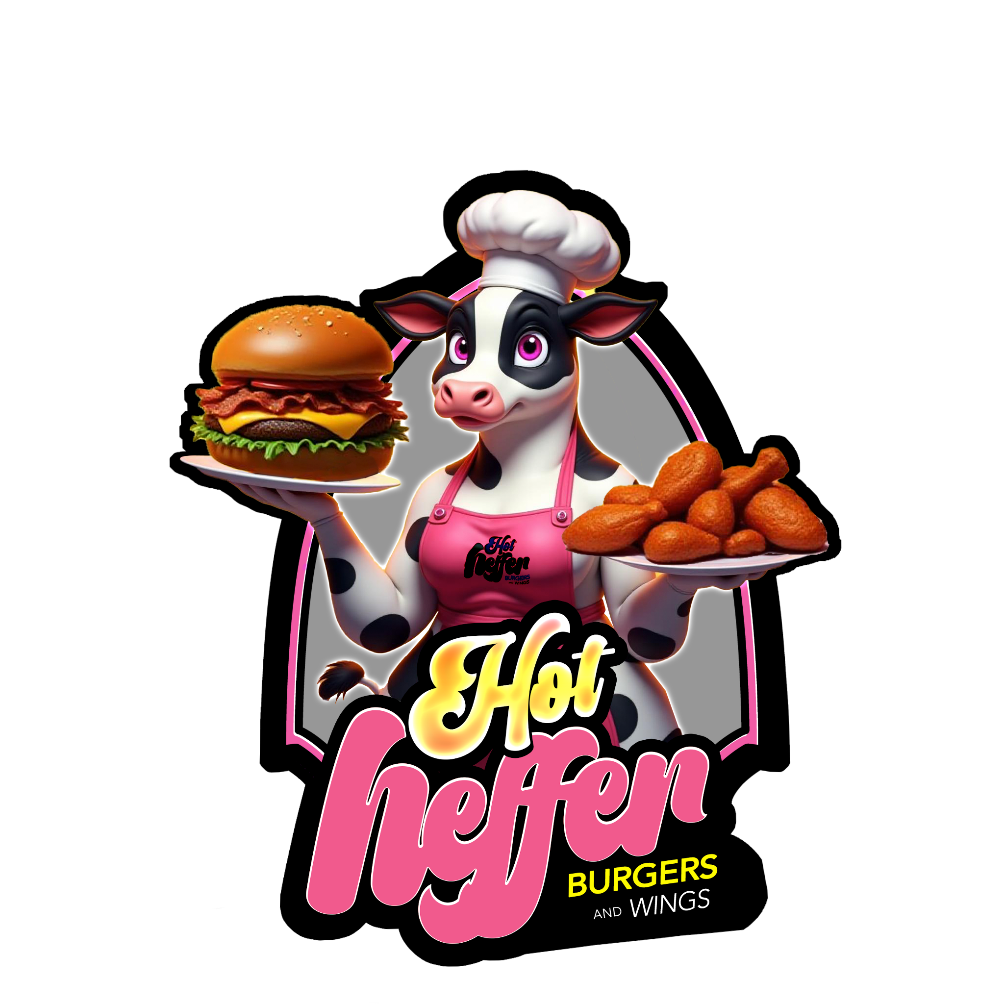
🐄 Meet Queenie: The Star That Steals the Show
Now, onto the diva herself: Queenie.
Mascots are like mini-brand ambassadors. Queenie needed to personify the brand—stylish, cheeky, confident, but still approachable. She’s a glam cow in a chef hat and a killer pink apron, holding a milkshake like she owns the place (because, let’s be honest, she probably does).
From her eyelashes to her stance, every detail was carefully sculpted to make her pop off the page and into people's hearts. I leaned into stylization to avoid the uncanny valley and instead create something visually magnetic.
🎯 According to Harvard Business Review, emotionally connected customers are over 50% more valuable than those who are just satisfied. That’s why Queenie had to feel like more than just a mascot—she had to be a personality.
🧃 Adding Depth with Details
Look closely, and you’ll see Queenie holding a stunningly stylized milkshake—cherries, whipped cream, and all. Well, not in the image about, but in the finalized version, she got it. Anyways, it’s not just a treat—it’s a statement. Every element in this design tells a story:
-
The pink apron matches the logo, reinforcing brand unity.
-
The chef’s hat adds authority and playfulness.
-
The cherry-topped shake teases the sweet treats on offer.
💬 “Design is thinking made visual,” said Saul Bass—and he wasn’t wrong. Every curve, color, and character choice was intentional.
🛠️ Iteration Nation: The Power of Refinement
No design is born perfect. The journey included:
-
Testing font combinations and shadowing styles.
-
Adjusting Queenie’s posture and facial expressions.
-
Refining the glow effects and color contrasts.
-
Making sure the design worked in both color and black-and-white formats.
Each tweak brought us closer to that sweet spot where style and function meet.
🎯 Final Thoughts: Brand Design That Hits Different
Creating the Hot Heffer logo and mascot was a deliciously creative journey. It was about more than aesthetics—it was about building a universe customers would want to step into.
To recap:
-
We used color psychology to set the tone.
-
Typography brought vintage energy with modern confidence.
-
Queenie brought heart, humor, and instant recognizability.
🔥 In the end, this isn’t just a logo. It’s a brand with a soul.
So the next time you spot a sassy cow in pink slinging milkshakes, remember: bold branding doesn’t happen by accident—it’s carefully cooked to perfection.